
Create Server Optimization
Originally, I was tasked to refresh the Rackspace Mobile App UI to align more closely with our web portal(s). When working on the current “Create Servers” flow, though, I recommended we overhaul the entire process for a more intuitive and enhanced user experience.
While not initially scoped as part of the refresh project, I wanted to challenge myself to improve the existing experience and share why this should be an important update to include in this refresh. Here is how I did that!
- Role: Lead Experience & Interface Designer
- Platforms: Mobile Android & iOS
- Project Length: September - December 2018 (3 Months)
Expected Outcome
Increase productivity (reduce uncertainty) when adding a new server. Expand feature parity between both iOS and Android platforms.
Critique
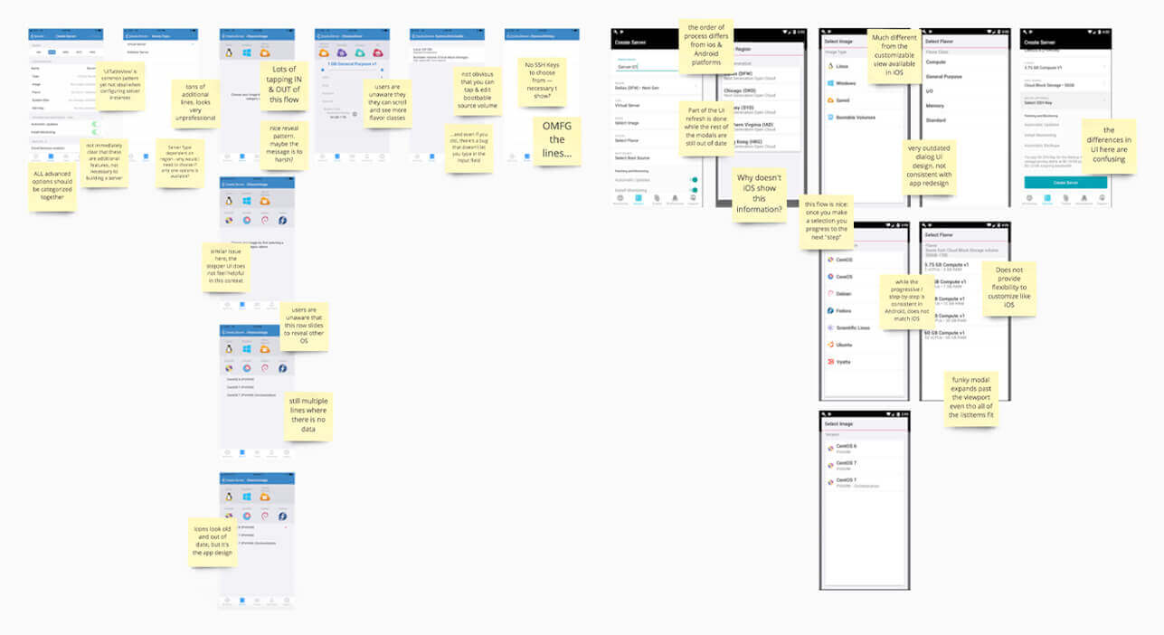
I took screenshots of the current flow for both platforms and performed a basic heuristic evaluation on what I thought could be improved and issues that needed to be addressed. Here are some high-level problems I wanted to solve:
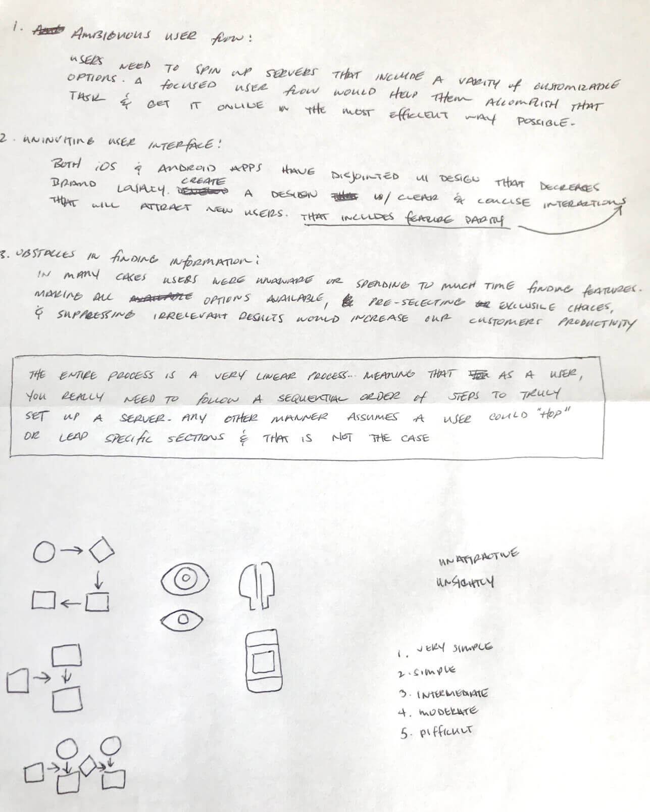
- Ambiguous User Flows
- Uninviting User Interface
- Obstacles in Finding Information
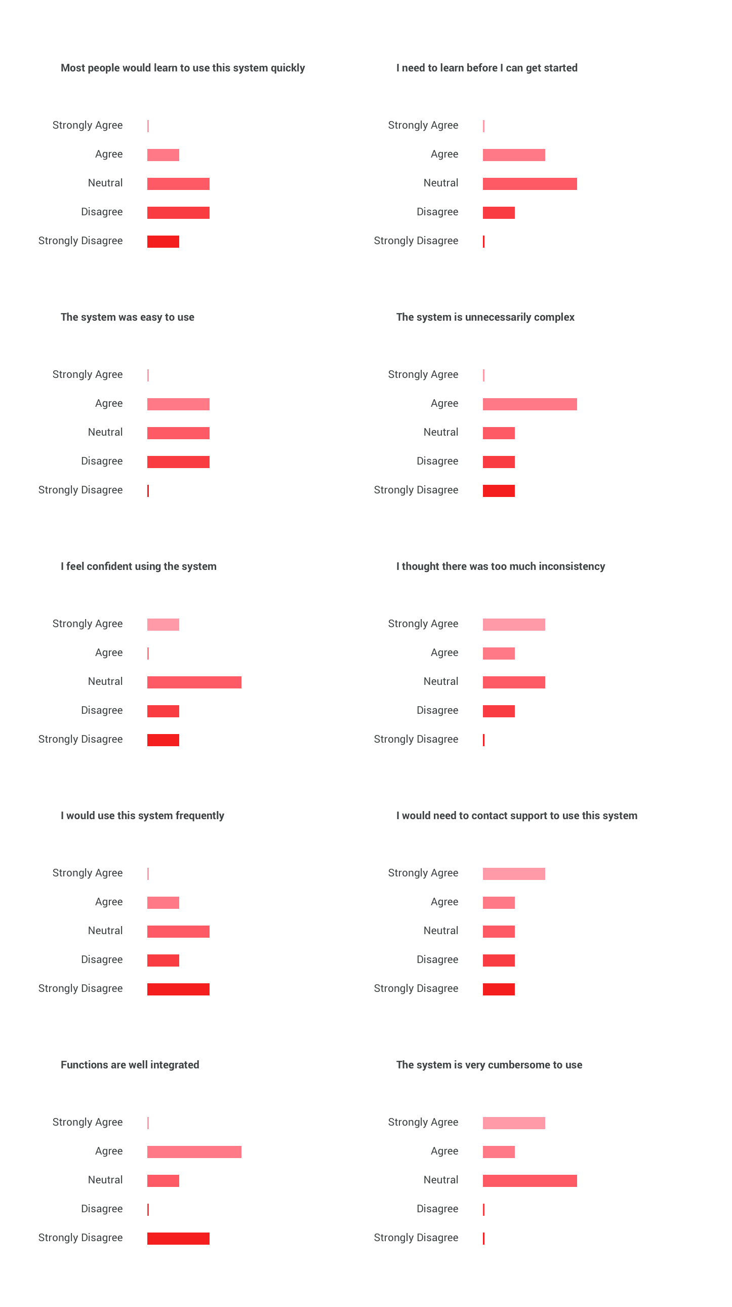
User Interviews
With limited access to actual user interviews I revisited previous research readouts from other studies on servers. I highlighted things that I thought would be most helpful that could help guide my decisions.
Conceptualizing
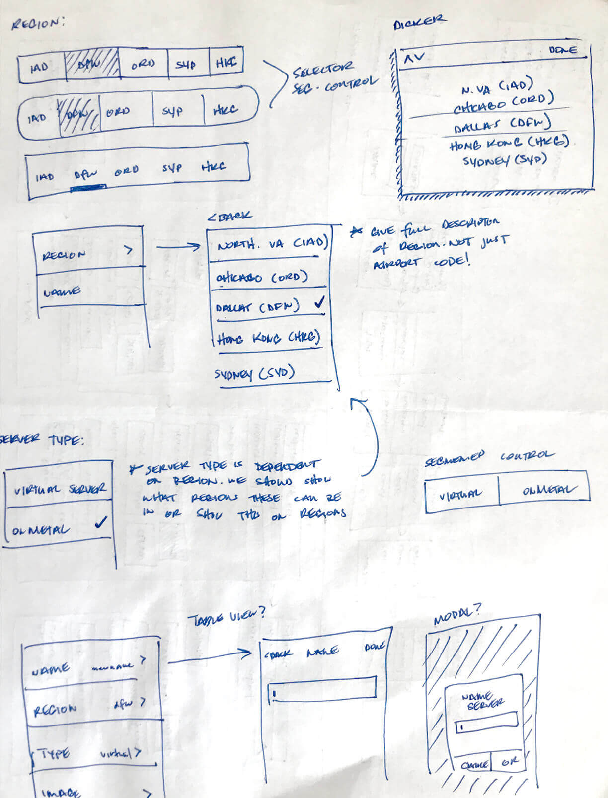
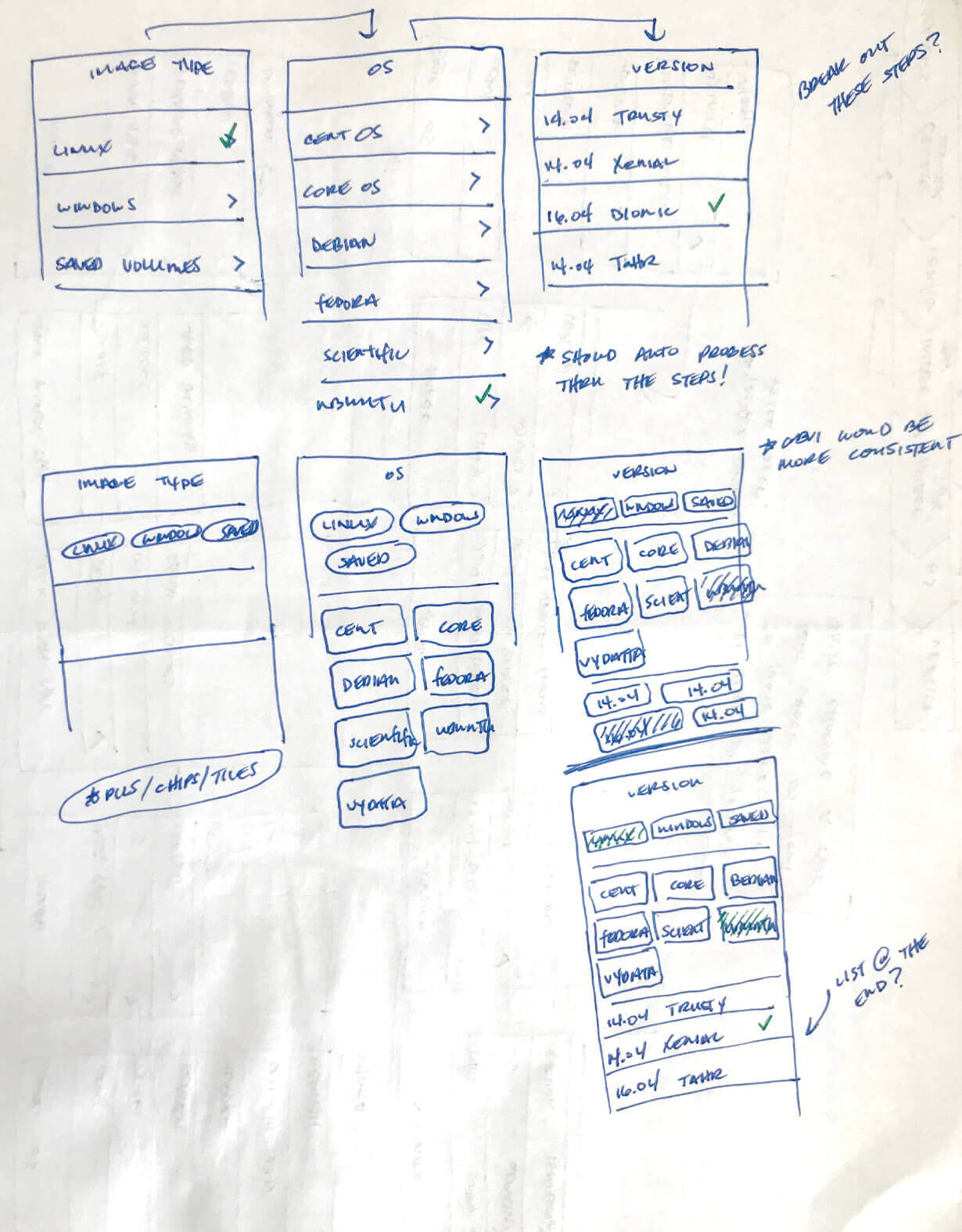
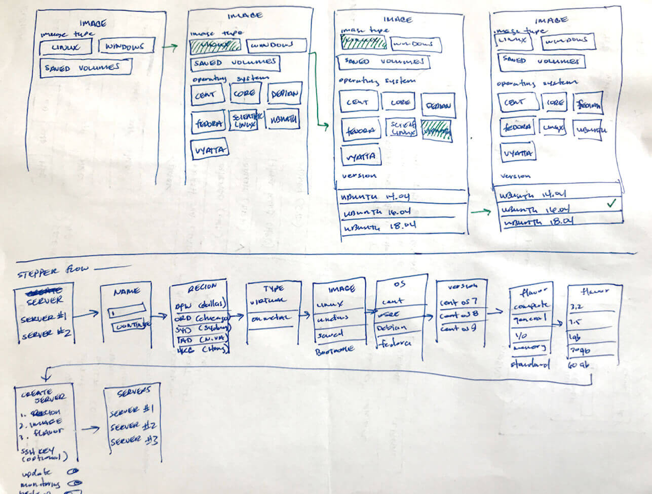
Now, parts of the design I thought made sense. Others just felt out-of-date. How could we make things more clear? I wanted to fix features like ‘Image Type’ that had usability issues while making others more discoverable.
Create Flow
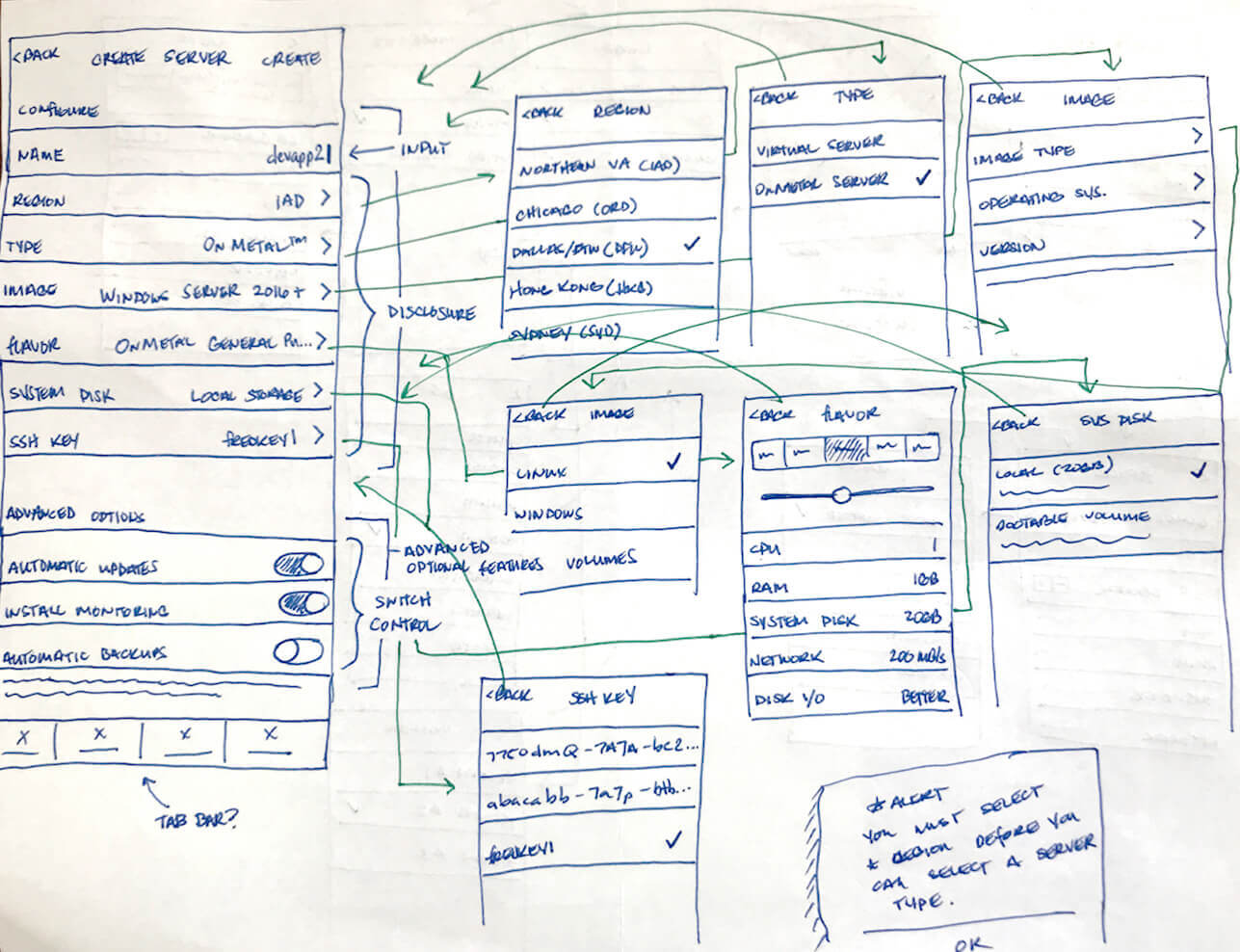
My first idea was to improve the process of the native experience, using a UITableViewController. However, as I iterated over the ideas and native components, it was clear I still had more concerns than confidence.
Challenges
The native flow required too many taps and could get very deep, awfully fast. The hierarchy tree just seemed to get super complex in some areas and while most of the pieces fit, there always was one or two elements out of place.
A Table view gives the perception that selections can be made in any order when in fact, configuration works best in a more linear process.
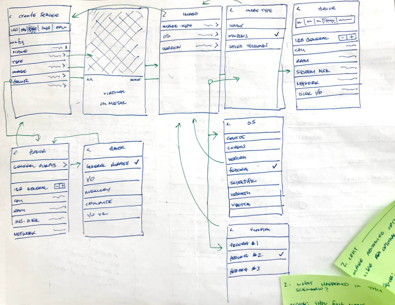
The current flow of configuring an image is not bad. Out of date, visually? Totally! But it worked and with a few usability tweaks, could still potentially work today. So, that's why I adored the idea of using chips/tile/pills to select, customize and configure servers. However, getting the components to fit and play nicely together proved to be difficult.
Stepper Flow
With a lot of iteration and brain storming, I explored a potential stepper flow in more detail. The idea here is, it would be more of a step-by-step process versus a customizable or table view model.
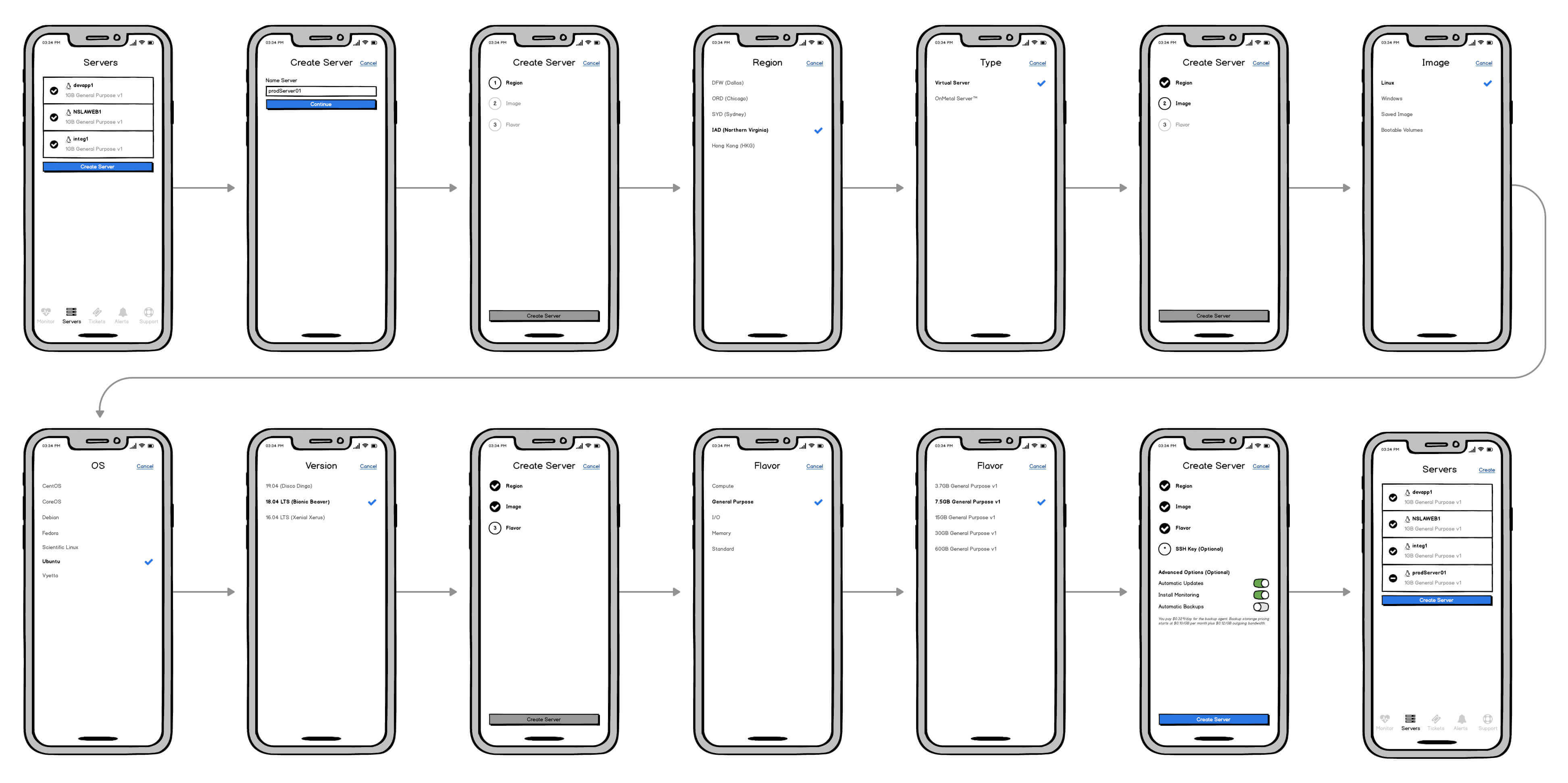
This new direction was met with a lot of positive feedback from other focus area designers on my team. My next move was to prototype and test. Some of the feedback I gathered was:
- Including product & OS icons help facilitate recognition rather than recall
- Fix ‘Bootable Volumes’. It’s extremely buggy in the existing app, but the functionality should be there!
- Password(s) are not provided at completion. Make it possible for the user to know what the password is.
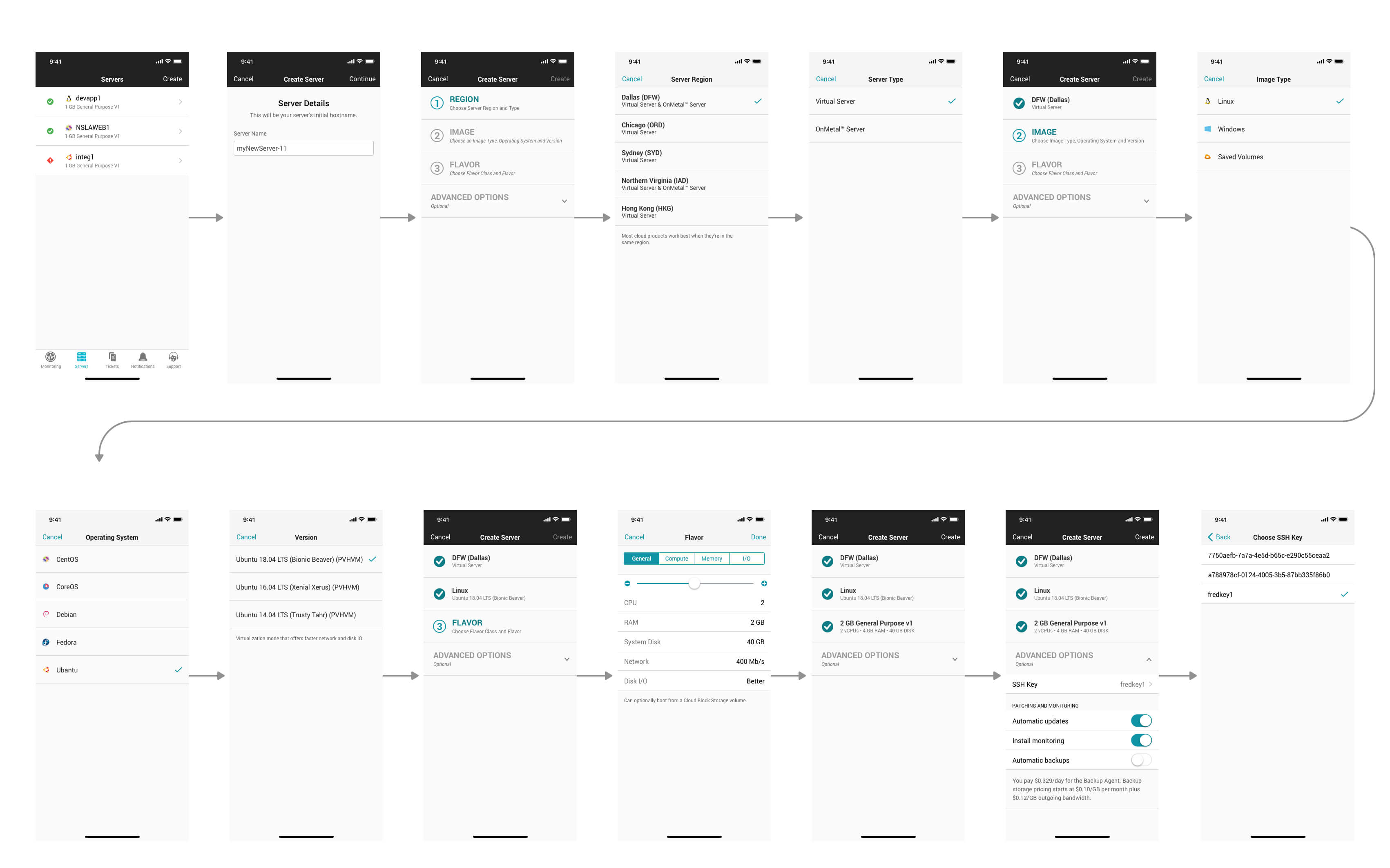
Version Two
Still showing my work and gathering thoughts, ideas and suggestions. I begin shaping the interactions & visual design. Improvements made within this revision cycle included:
- ‘Server Type’ is dependent on ‘Region’. Users should know that ahead of time in order to choose the correct ‘Region’
- A ‘Segmented Control’ would not scale well for flavor classes. What other elements or controls could we use?
- Navigate the user back to the summary view after a step is complete
- Avoid frustrations by breaking up into smaller primary tasks
- Selecting from a list of pre-config options do not work for our users, let them configure
- Make "Additional Options" look more optional. Still appears that it's mandatory
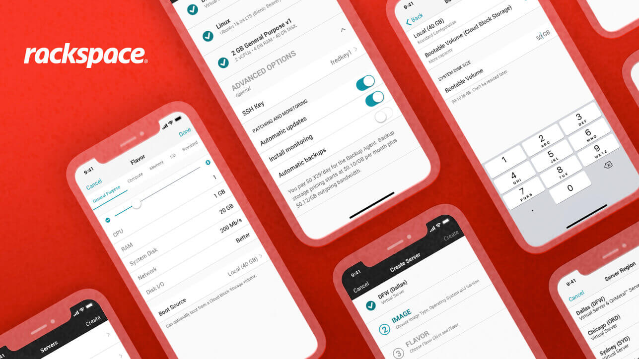
Final Redesign Flow
After several smaller rounds of in-house usability tests and making small adjustments to the mockups & prototypes, we landed on a new refactored flow for spinning up servers on mobile devices.
While most of this project is shown for our iOS customers, I was designing for the Android team as well, in parallel. Strictly adhering to both the Human Interface and Material Design Guidelines.
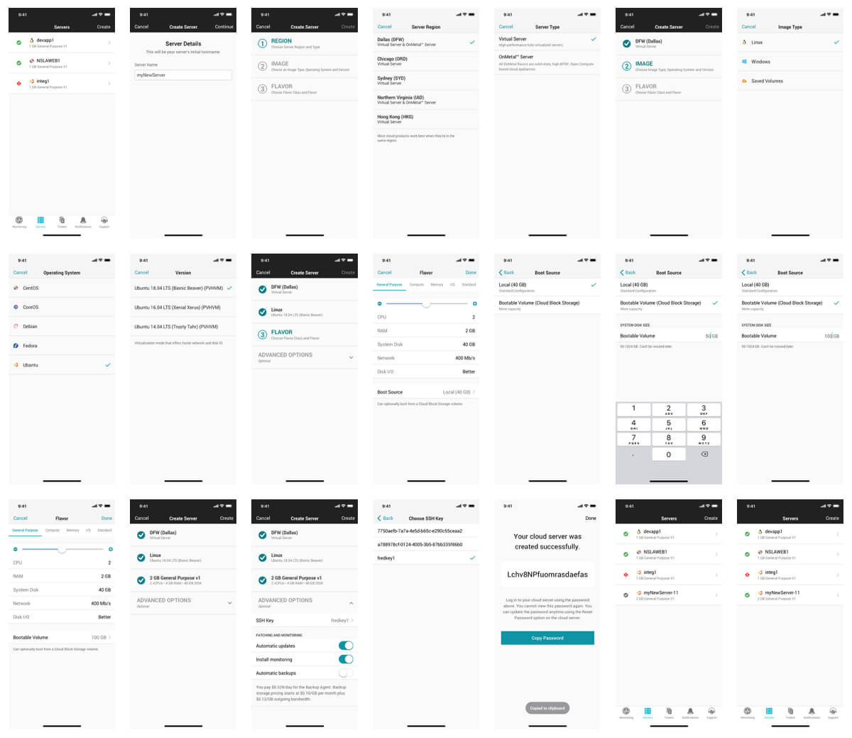
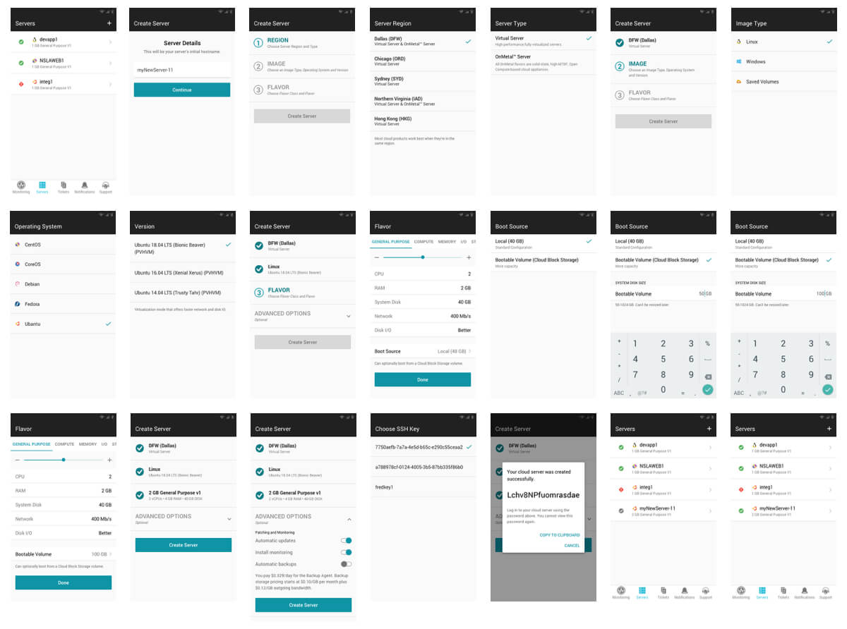
View and try out the new experience available in the app stores for iOS and Android.
Final Outcome
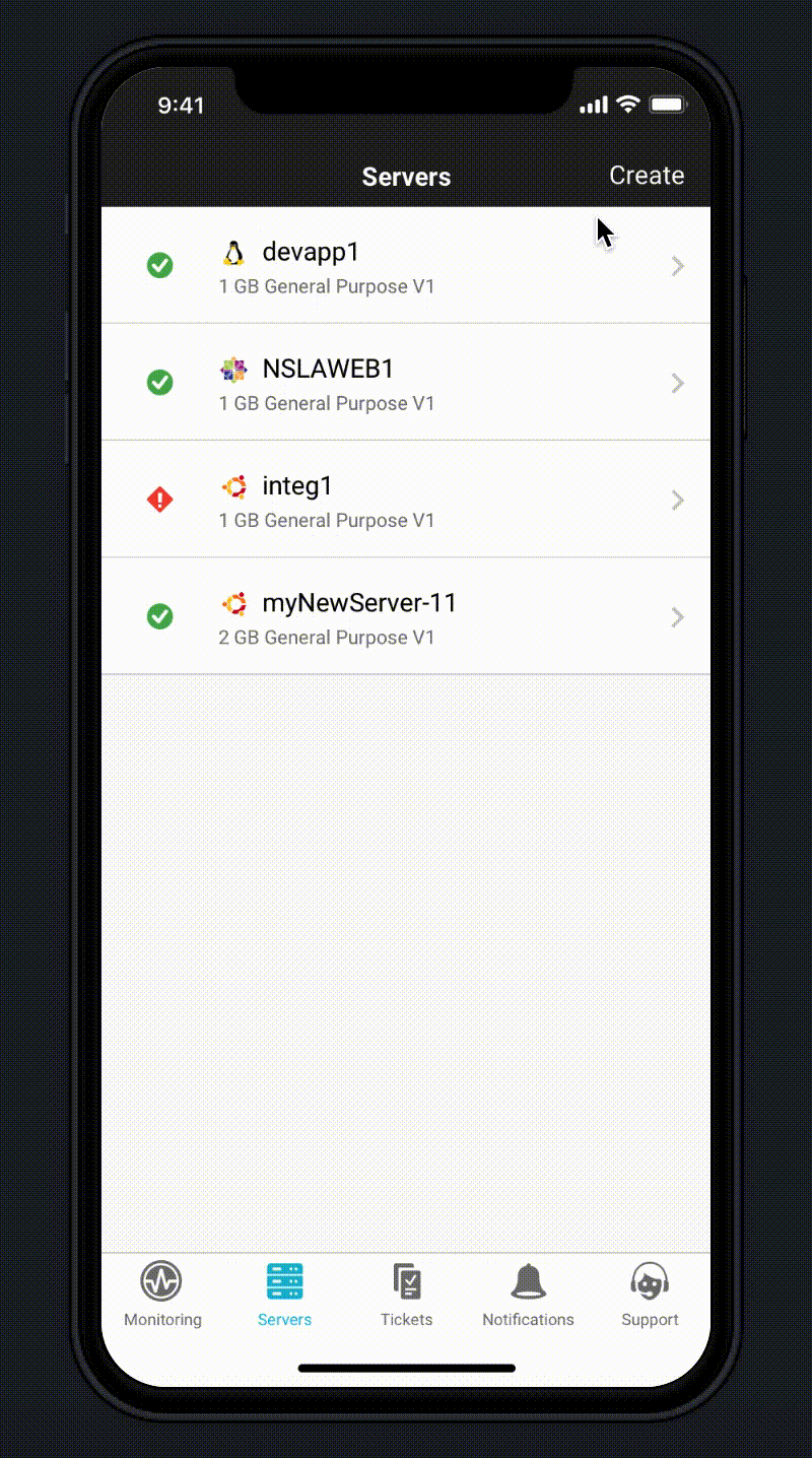
Delivered a user-friendly interface, aligned with user needs. A quick and intuitive process flow that adheres to the iOS Human Interface & Android Material Design Guidelines. No feature loss, as well as, fixing Bootable Volumes issue and providing customers with passwords upon creation. Fully optimized to increase the productivity of creating server activities while on the go.