
Taxi Driver App Design
- Client: Taxi Driver (Unnamed due to NDA)
- Role: Lead Interface Designer
- Platform: iOS
- Project Length: Aug 2018 - Dec 2018 (4 Months)
In the fall of 2018 I partnered with Taxi Driver to redesign their mobile iOS application. The goal of this project was to deliver a visual design language based on a live prototype as a part of their introduction into the rideshare market.
I lead the visual design while working alongside the project manager and creative director for the company. To begin, I was provided the following:
- Project brief
- Brand guidelines (logos, color, typography, fonts)
- Wireframes
- Design assets (logos, icons)
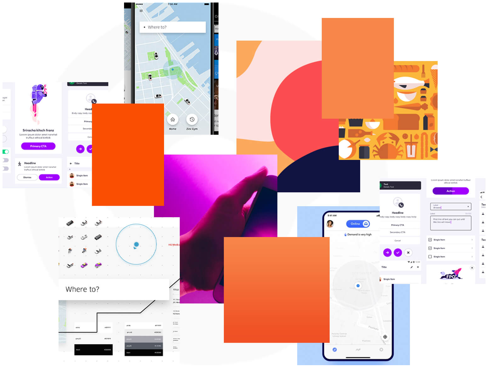
- Design Inspiration Examples
Additionally, I had a few technical restraints to obey:
- App structure (for the most part) must stay in place
- Brand guidelines adoption
- Deliverables must be iOS 8
The team gave me full creative freedom to experiment and interpret the references they provided, as well as, being very understanding in my thoughts regarding Apple’s Human Interface Guidelines and mobile best practices.
Design Exploration
The design direction was influenced greatly by the brand guidelines and the examples they provided to me. I also analyzed other apps similar to the athestitc that they were looking for. Furthermore, I familiarized myself with apps like Lyft & Uber by taking rides (not a frequent rider) to better understand the interface, interactions and casually speaking with drivers about what they liked and disliked about the driver apps they used to earn extra money.
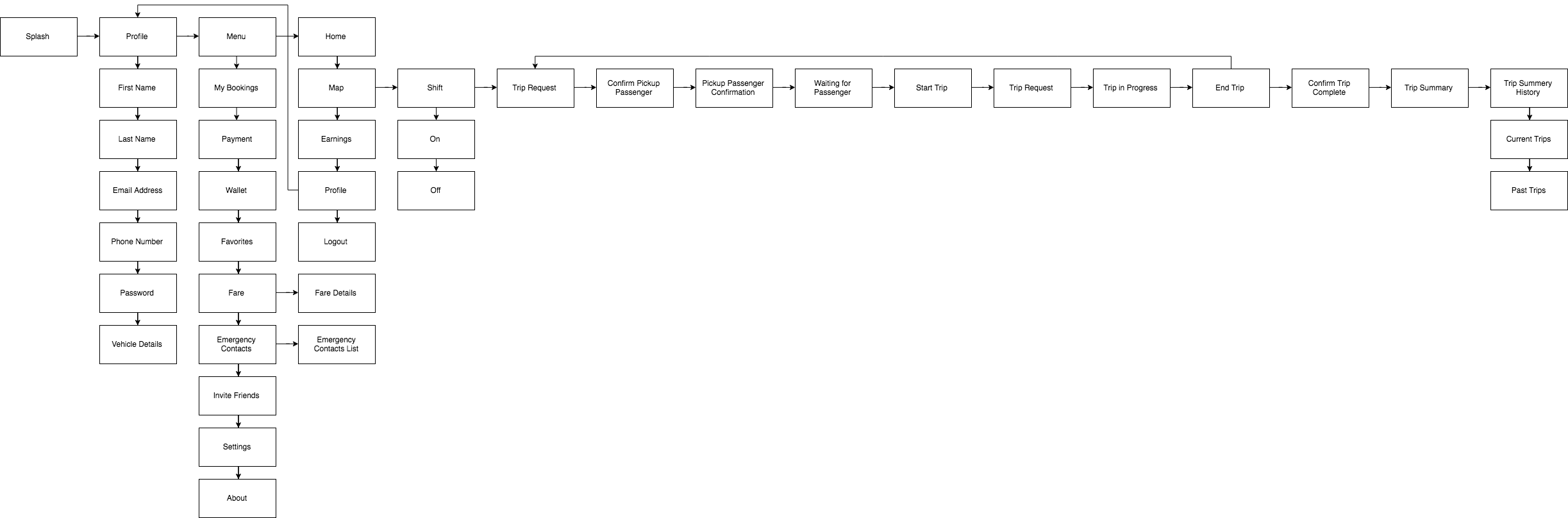
Userflow
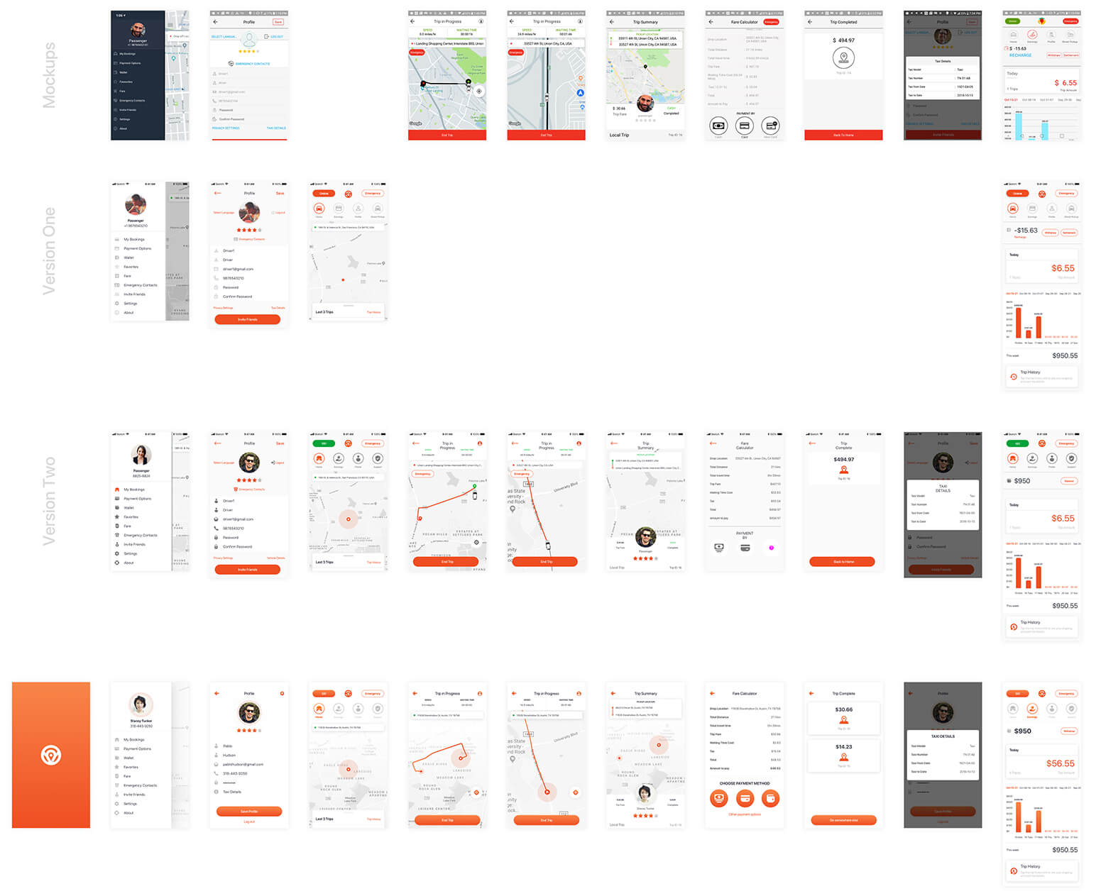
While the team provided a working prototype of the product, I still didn't have a great overview of the application workflow. So after generating a moodboard, I went through the app and developed a sitemap to ensure I was covering all screens. Also, highlighting any gaps in the experience.
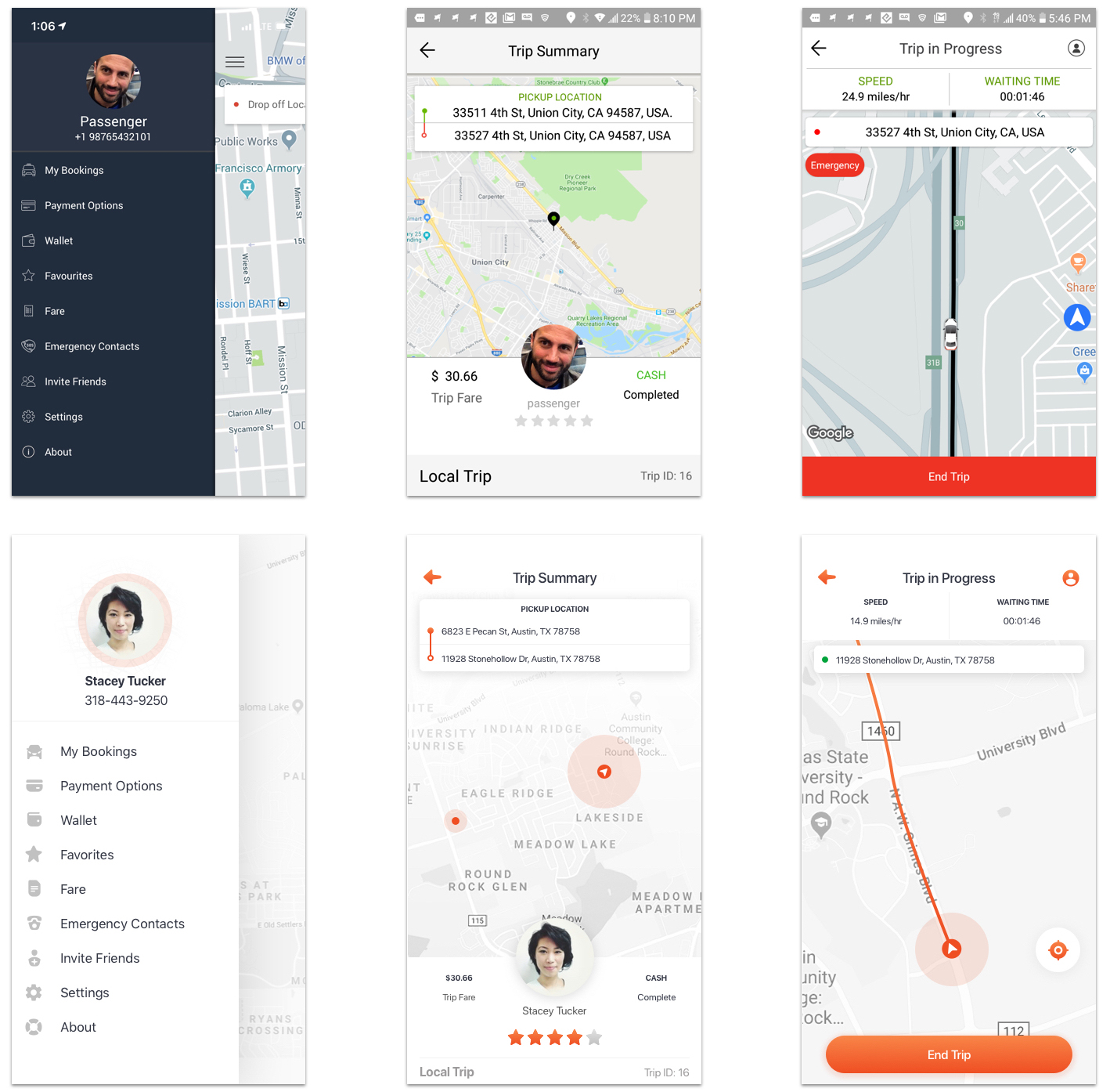
Design Evolution
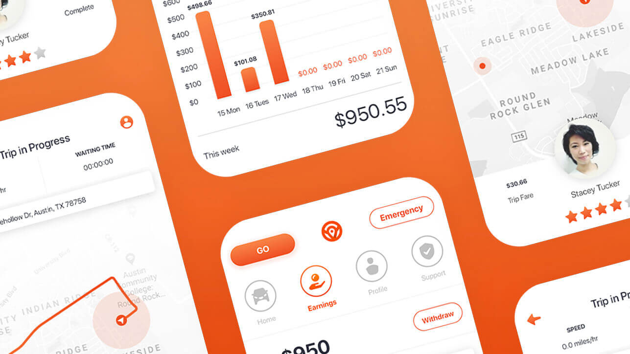
Overtime, the design of the app truly comes to life. Shifting from darker hues in the UI to adding more white space and a modern interface design. Smaller adjustments were made until getting approval for all screen views.
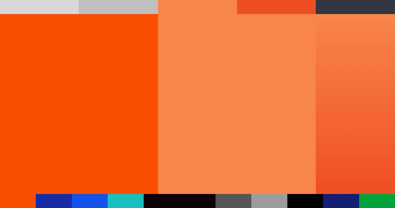
Color
Choice of colors were based on the pallet provided to me at the start of this project. Orange is a very exciting and enthusiastic hue that gives this product permission to be a little fun. Aside from orange, the brand had a wide pallet that I needed to simplify to prevent clashing and maintain balance. To avoid an overly flat design I made the decision to introduce an additional tinted orange hue to establish a gradient color swatch.
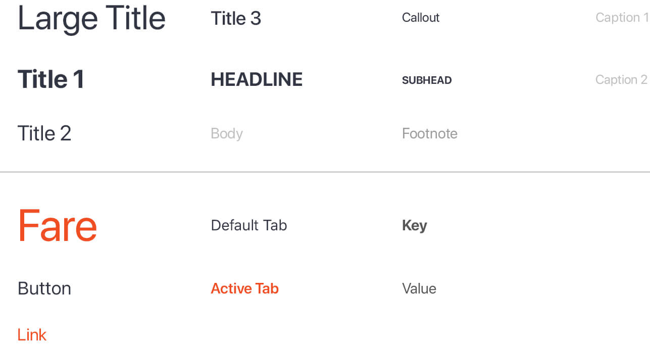
Typography
Like most brand guidelines, Taxi Driver employed font families specific to their brand. However, we decided that native fonts provided many benefits. In this specific case, leveraging iOS system font San Francisco. Some of the benefits that made this exciting are:
- Faster loading times
- Extremely legible
- Optimizes type dynamically
- Supports alternate languages
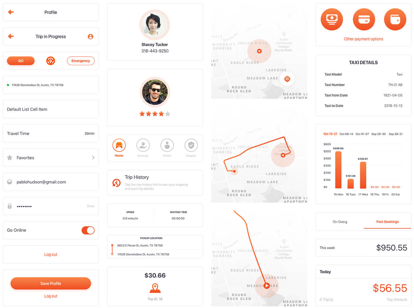
Product Design
My goal here was not just design a beautiful interface, but to create an aesthetic pleasing product that helps improve the user experience. Because I had constraints to keep the structure of the application intact — I thought it was important to give elements visual contrast, increase white space, convey depth and adjust proximity of components. This is important for the human eye to locate what is important and show emphasis.
UI Elements
To aid the user in navigating through the product, I designed the interface elements to align to human interface guidelines. I also developed a library of symbols to keep the patterns and components consistent.
Closing
This was a bright and challenging project that follows me taking unenthusiastic mockups and transforming them into a competitive and attractive product interface that required well thought out rational in efforts to excite and improve the experience for riders and drivers alike.
While an improvement, I would have liked to spend a little more time on the typography styles. I could have made better use of typographic hierarchy, along with, better color assignments to those fonts.
I also believe there is still a slight overuse of orange. I believe there's some areas where a darker grey or perhaps another color could work best to emphasize those elements.
“Daniel is a very good freelancer, always open to collaborate. Very strong with sketch!” — Carlos C., Creative Director
I successfully delivered a total of 69 views for a MVP driver and rider mobile application. I eagerly look forward to hearing how the product has been received thus far and hopefully seeing it released to the App Store one day.