
Redesign Rackspace Mobile
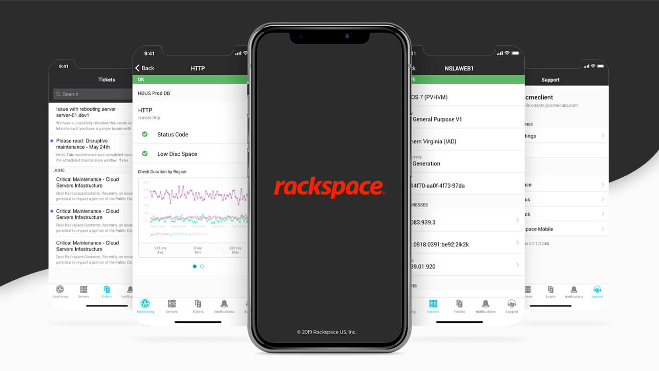
At Rackspace, there came a time where we had to completely reimagine our apps visual identity, pivoting our look and feel to be more consistent with what our customers' relationship with the online web portals tend to be. This was an opportunity to take what was already there and fine-tune it for a more satisfying experience.
- Role: Lead Experience & Interface Designer
- Platforms: Mobile Android & iOS
- Project Length: May - July 2018 (3 Months)
Problem Statement
An Infrastructure Manager is skeptical about using the app because they have never seen a blue Rackspace product and it's cumbersome to use. However, they need a way to analyze environment status on-the-go, for when critical or unforeseen situations occur.
Primary Issues
- Customers can't tell if they're using the correct app
- Low awareness and adoption
- Individual branding and iconography
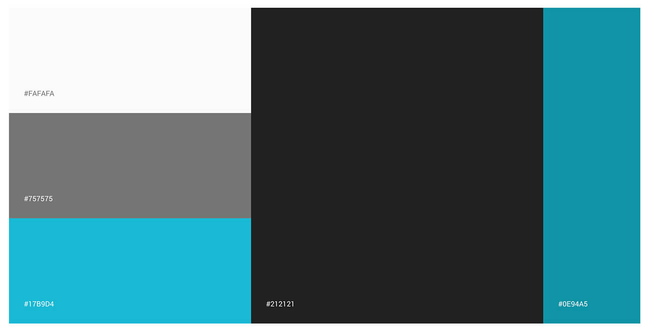
Color Strategy
Research revealed that having unrelated branding gave the perception that customers are using the wrong app. With a design system in place, I developed a mobile library to unite our mobile presence with our online portals.
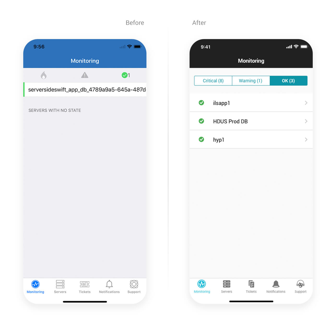
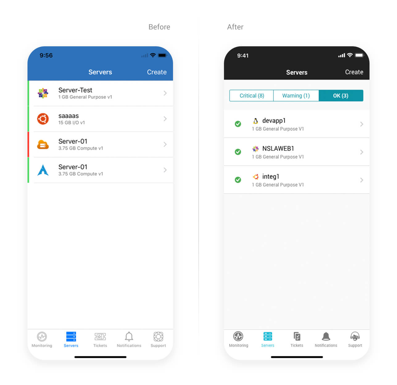
Functionality
The majority of the layout and flow are almost identical. Yet, there were inconsistencies between tasks that were ripe to tidy up. For example, ‘Monitoring’ made use of 3 categories (originally, only represented by an icon) for different levels of status. Meanwhile, ‘Severs’ simply placed all instances in a single list relying only on the use of color to differentiate their current health.
In efforts to improve the experience where it would require a minimal level of effort from engineering, I did the following:
- Reduce ambiguity and reinforce the meaning of icons by including labels
- Positioning status icons next to the items that they were specific to. This allows users the affordance to not have to rely on color alone to convey the condition
- Divide ‘Servers’ into a similar segmented architecture so that one could view and manage tasks more quickly
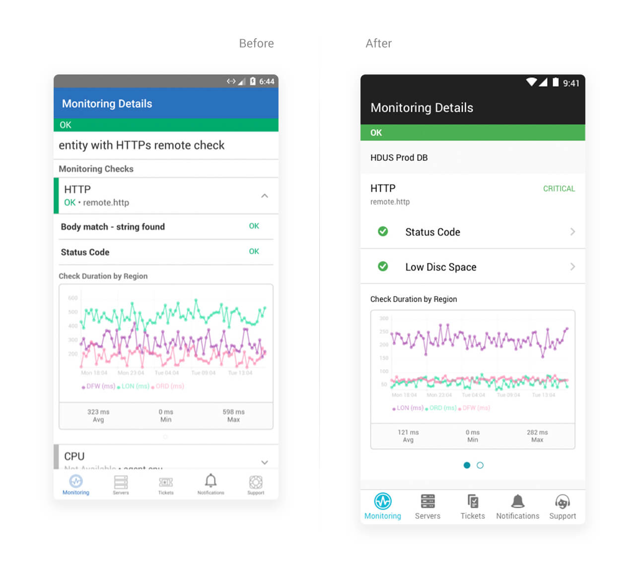
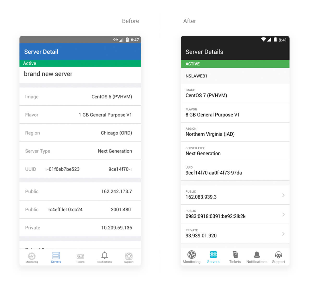
In most cases, I delivered a no-change scenario that was supported by an alternate solution that I advocated would enhance the usability and overall experience but would require buy-in from our development and product stakeholders. Our ‘Monitoring’ and ‘Server’ features are perfect examples of going to battle for our customers, and in the end, the revised solutions made the most sense and were implemented.
“Did you know, that 4.5% of the global population experience color blindness? That’s 1 in 12 men and 1 in 200 women!”
Consistency
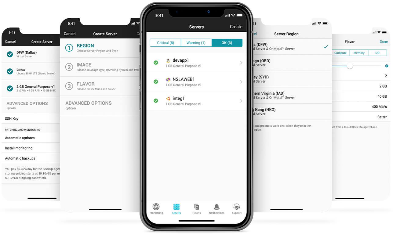
Our customers also have a need to create resources and communications while on the go. Previously, these tasks were thought about individually and handled much differently. However, opting for a reimagined experience that was consistent for all situations where a user would need to create something new, there is now a refactored step by step flow.
Communications
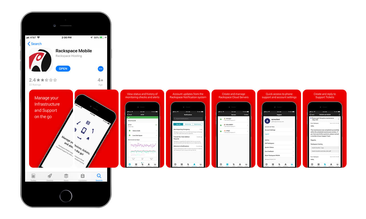
One of the most important features of the Rackspace App are Tickets followed by Notifications. Here, users can view their tickets, see any activity that requires attention, awareness of alerts or monitoring status they have enabled, along with the ability to respond directly to a Rackspace support tech or generate a new support ticket to get assistance with right away.
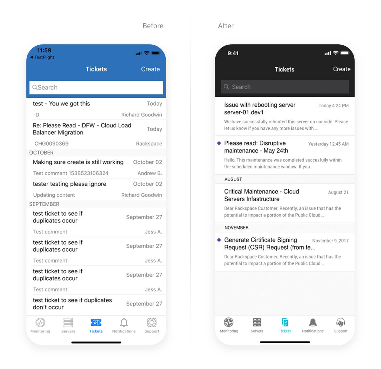
This was a big challenge because this would require implementing a new backend API which would handle the user flow much differently. Also because the mobile design is always limited on space. To achieve this, I revised the date/time stamp pattern so that it would be consistent. Made sure that subjects and comments were truncated after a maximum of 2 lines each. Then, I added an indicator that would tell users which tickets need attention, just like they would see on the web portal.
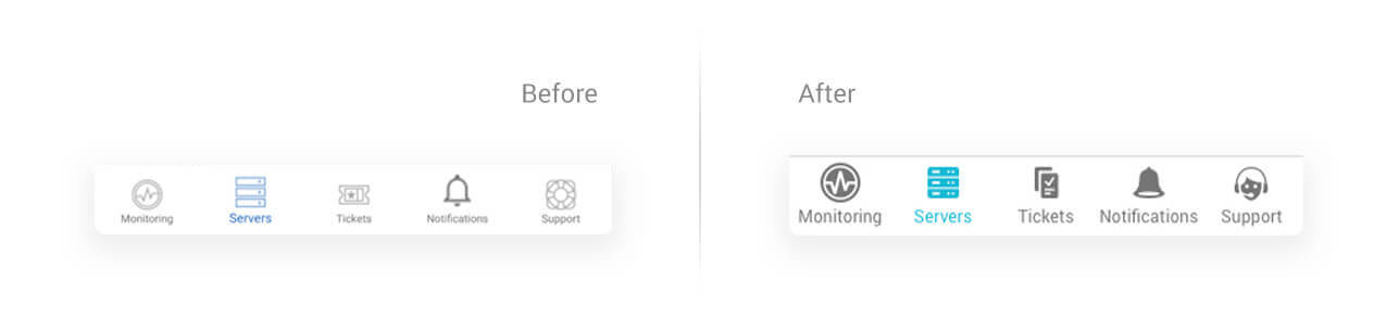
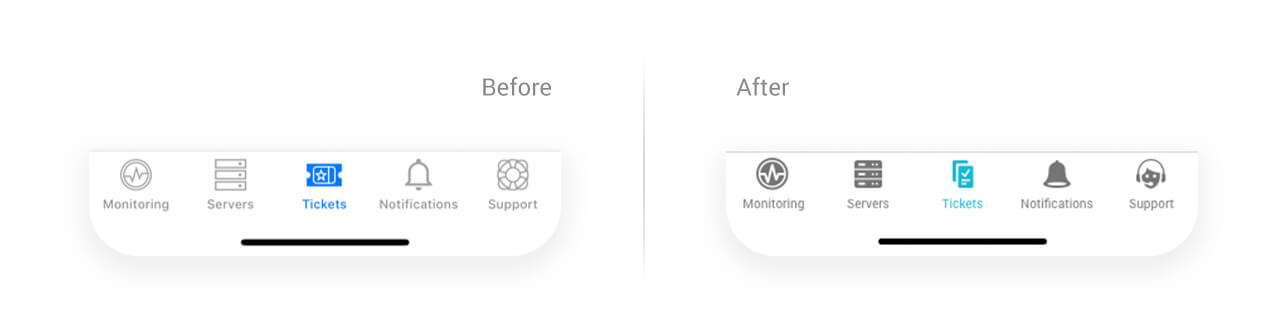
Icons & Navigation
In addition to the screen redesigns, updating the iconography in the app was another task necessary to tackle and bring consistency and clarity to their meanings. I had help from another designer on my team to help document and analyze all of the differences. Let’s take a closer look at how this was achieved in our navigation.
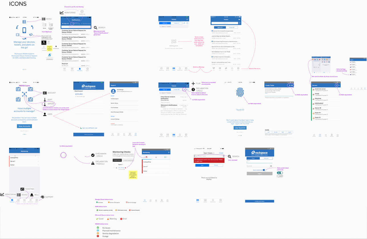
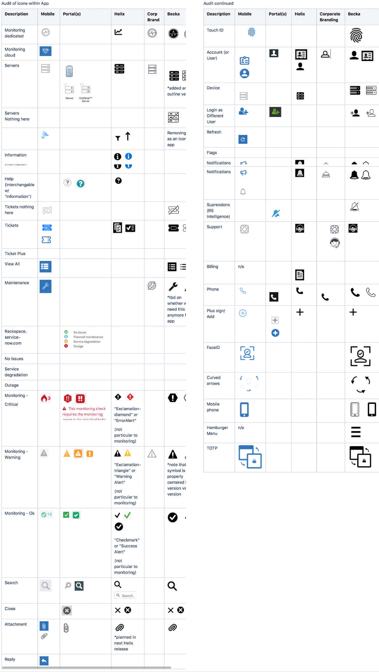
They are as follows: Monitoring, Servers, Tickets, Notifications, and Support
- Monitoring: This was probably the icon that needed the least amount of work, however, Rackspace had several different icons in use for this. Using a heart reference didn’t seem to make a lot of sense to our users in terms of IT devices so going with a simple pulse instead would still communicate ‘health’ but not necessarily human health.
- Servers: Our UI library designers worked incredibly hard to come up with a few standard system icons to working inside our portal so no need to recreate a visual that our users were already familiar with. This one’s a keeper =)
- Tickets: Yes! The movie ticket is a pretty universal indicator to communicate, well, tickets. However, our customers favored an icon that was designed and already in use within our web UI. So, again this one remains unchanged.
- Notifications: Somehow we had two different types of bell designs in production for each platform. Therefore, we used the design system asset and updated the icon to ensure consistency across all interfaces.
- Support: Lastly, our design system had a published support version in use and implemented on the web, so a simple swap makes for coherence in our mobile navigation.
Results
Short. Sweet. Big difference!
Since the release of this update, we saw a significant increase in total users, over 40%, since shipping the rebranded Rackspace Mobile App Look & Feel.
So there you have it! I hope you enjoyed taking a look at some of my process and thoughts behind the redesign. Download the app for Android and iOS.