
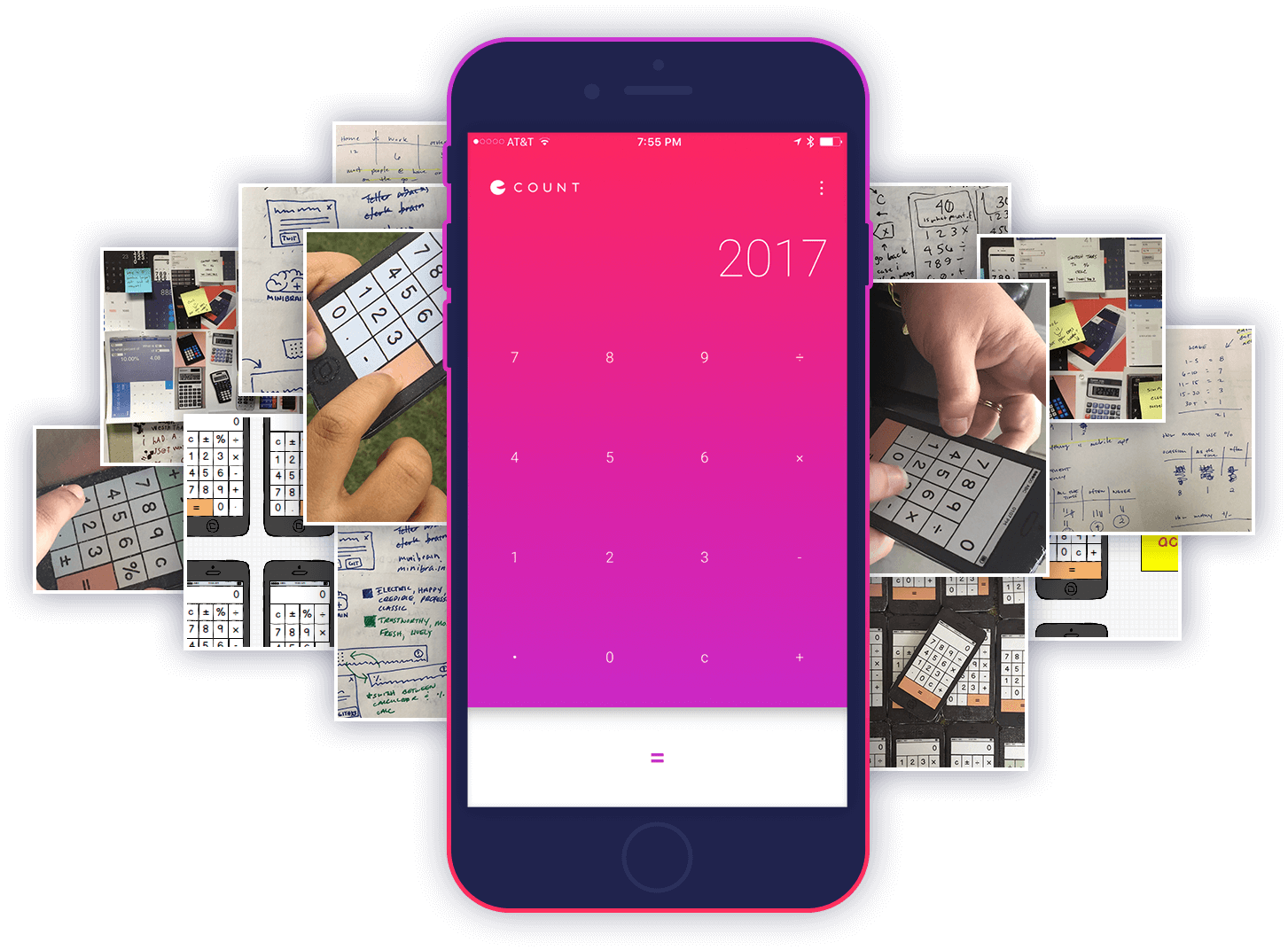
Count Calculator
Overview
Count was a side project specific to rejuvenating dull and tired calculators. The challenge was to create something usable and beautiful. As a casual user myself, I found that the free and paid number crunchers in the App Store were too complex, unintuitive or just plain boring. The solution created was largely influenced by my own personal experiences.
“Count is a fashionable calculator that allows you to do math quickly without the hassle of ever having to think about it. Same outcome, just a better experience!”
Problem
To start, I began researching the history of PDAs. A flood of questions came to mind when I thought about calculators, their design, and overall use. I was curious to explore other creative ways to accommodate users like myself who faced similar issues.
List Heading
- What's actually being used? Math alone can get overwhelming quick, so what are the essential mathematical functions we need? Why are some keys twice the size of others? Why is the equal key so teensy? 00s? What do some of these even do?
- Button architecture. The location, arrangement and architecture of most calculators have worked for many years. But think, could this be better? The equal button is the most often used action because it is vital in evaluating the result of every operation.
- They're ugly! At the end of the day, who really cares if a hideous tool gets the job done, as long as it’s correct, right? This would merely be a cherry on top.
Discovery
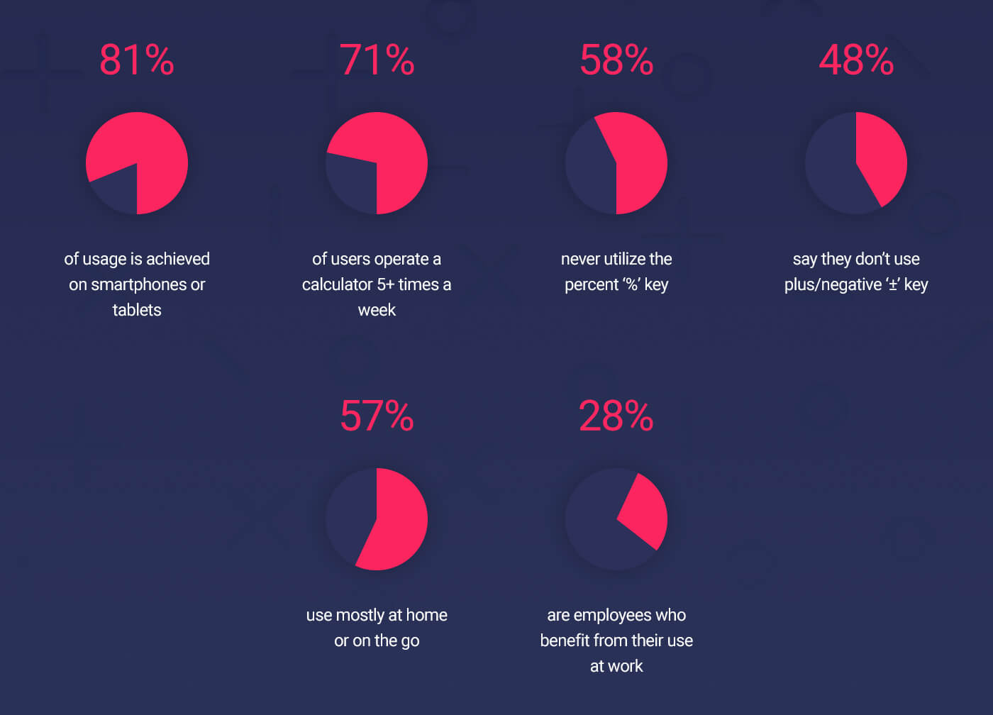
Surveys were filled out anonymously to get the ball rolling. I conducted in-person interviews shortly thereafter to gain further insights. By listening, observing, and taking notes on how people performed basic arithmetic, this is what I found:
- Designed for average people. Not everybody needs square root, memory storage, fractions, etc., etc. Outside of 10 keys and basic functions, 12 of 16 test subjects demonstrated that they wouldn’t use additional keys even if they are available. For example, most people would delete the entire expression if they made a mistake in contrast to using the ‘DEL’ or ‘C’ operation.
- It's easy to use. There should be nothing to learn. No onboarding process, start up screens or walkthroughs necessary. In most cases, users need the result as soon as the application is opened.
- Very fast. While the problem is still memorized, people need to input these values to obtain the results quickly. Meaning, the app should be quick to open, quick to input, and quick to receive an answer.
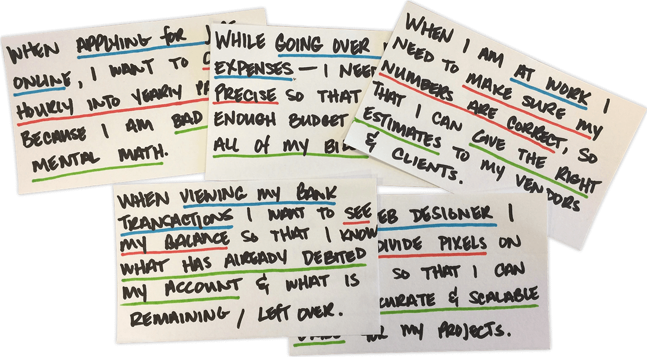
User Stories
It was important to truly empathize the juncture in time that a calculator is used. User stories based on all of the aforementioned data collected was one of the best ways to accomplish the task. Quick, brief statements allowed to quickly identify the user and their need(s) while safely iterating over ideas to resolve them.
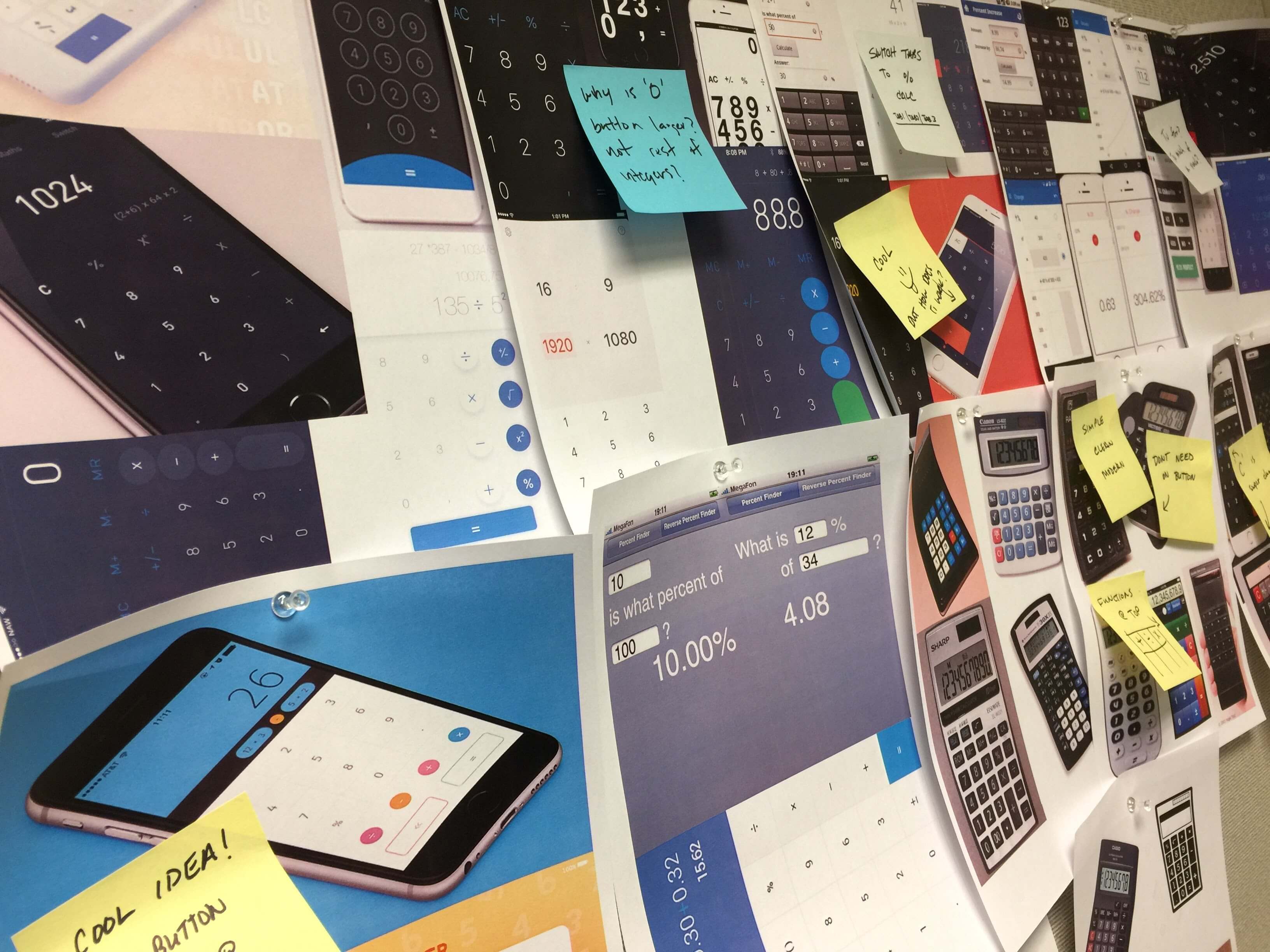
Sketching
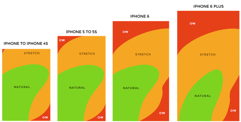
Focused on improving speed and usability, the most unique aspect of the app was placement of the equality button. Intriguing articles on alistapart and uxmatters regarding how owners hold their devices, screen sizes increasing not only in actual size, but also popularity — I thought, why not experiment and explore other alternatives?
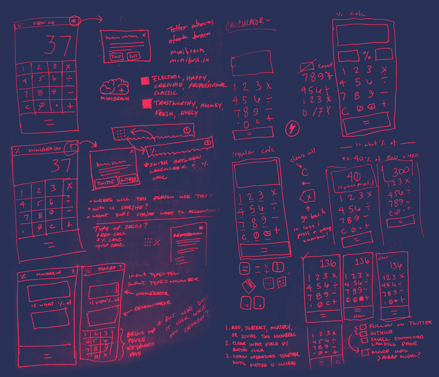
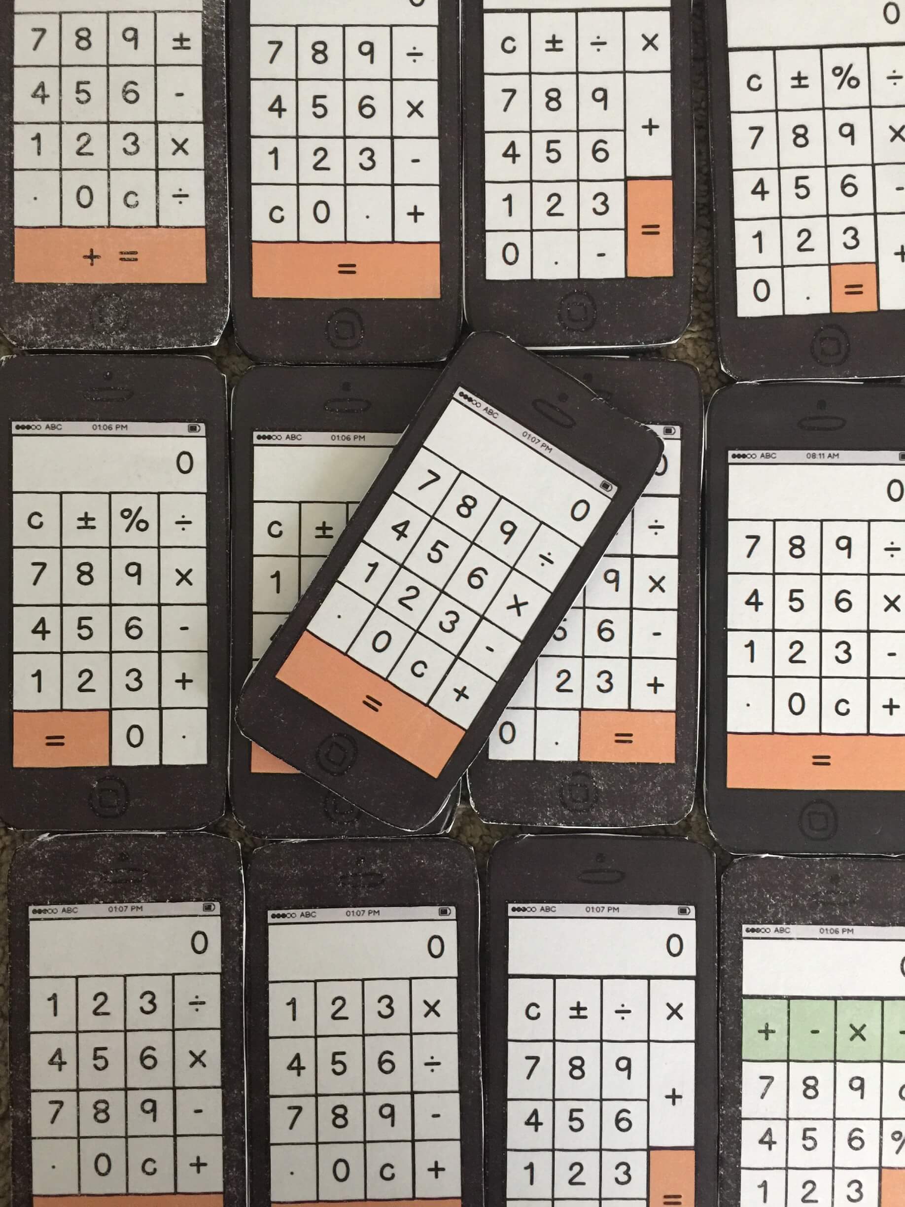
Prototyping
After brainstorming, lo-fidelity prototypes were developed. With the iOS calculator app being the baseline, small modifications were made to the arrangement of operations, integer patterns, as well as adding and/or removing seldom used formulas.
Design
Initial scope was to encompass an ‘all-in-one’ application that would provide basic calculator functionality along with tip splitting and percentage computing. Unfortunately, I needed to scale back my intentions so that I could focus on releasing an operative product.
App architecture was based on direct feedback, user testing and iteration. Users already familiar with common button layouts took longer to complete tasks on contrasting prototypes. That said, participants felt that ‘C’, meaning clear, was more clear than ‘AC’. Additionally, the decimal ‘.’ was placed on the left hand side due to its infrequent use. Finally, the equality operator scored admirably for its accessibility, which was a leading goal.
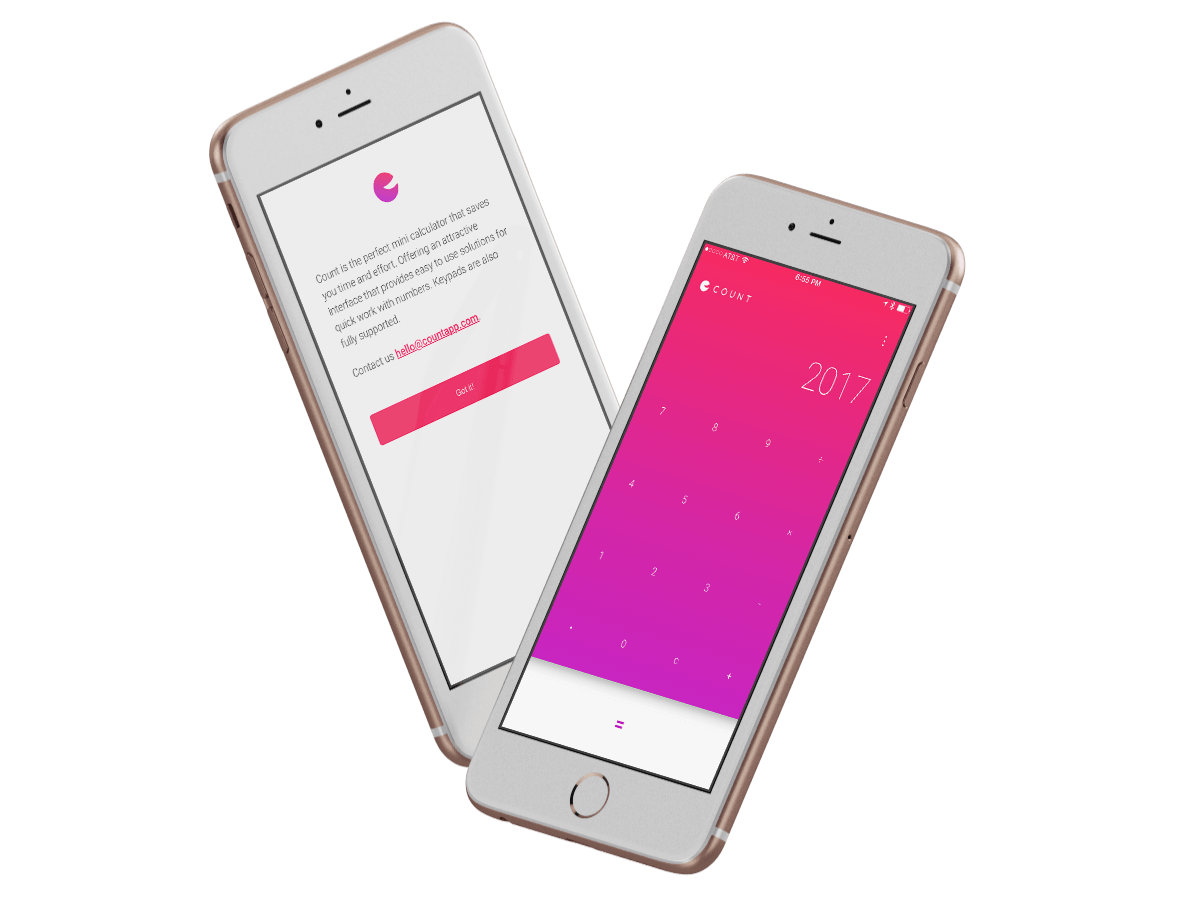
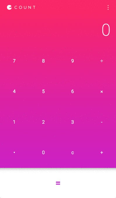
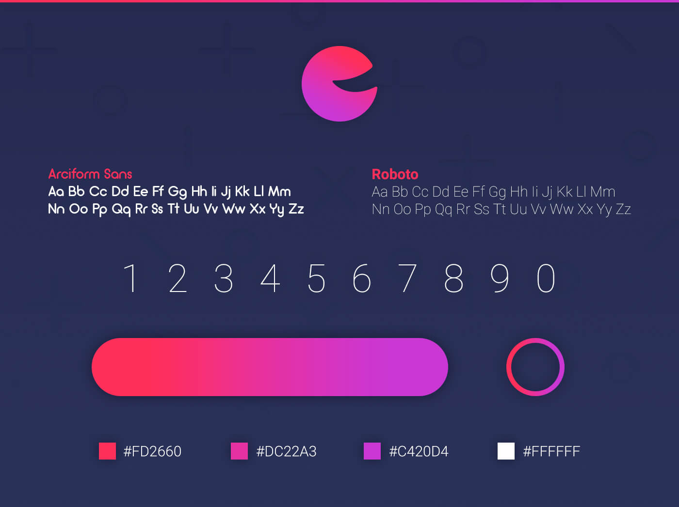
Interface is constructed of a beautiful relaxing gradient, uses one consistent typeface, Roboto, with various font weights to ensure readability and typographical hierarchy. It also contains subtle, yet smooth digit transitions. The icon resembles a pie chart where 25% of the smile makes up the whole.
Development
In order to spell out what the application would do for people using it, there needed to be a high level set of requirements to work from. At the core, it was desired that:
- As a user, I can add, subtract, multiply and/or divide two numbers
- As a user, I can erase the input with a clear button
- As a user, I can continue chaining mathematical operations together until I tap the equal button, and the calculator will display the correct result
This was the first time I used flexbox on a project and I was thrilled at how well it worked and how flexible it was. I sprinkled in a few micro interactions for feedback, and we had ourselves an app.
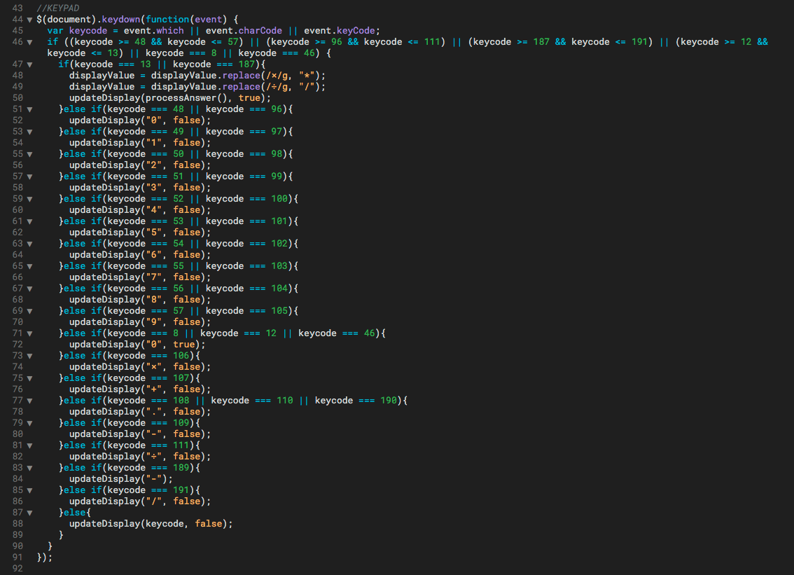
Other features included checking for display length and decreasing the font size if the equation exceeded view. Somehow I managed to hack my way through JavaScript regular expressions to swap keyboard operators ‘*’ & ‘/’ for multiplication and division symbols ‘×’ & ‘÷’.
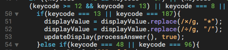
Delays on user tap gestures forced me to hook a wondrous library, fastclick.js to solve a 300ms lag on touch UIs. Super easy implementation against other polyfills and plugins previously used in the past. Keycodes for keypad conversion were also quite complicated to make compatible across all browsers. Unfortunately, I was unable to develop a Google Chrome extension due to the slow and unsafe eval() method.
Looking Forward
After two months of developing and roughly a month of research, COUNT was deployed and marketed mostly via word of mouth. Adding tip and percentage components are still very honest goals that hopefully come sooner than later. Producing a desktop or browser version is also highly desired. While I believe this was a successful first stab, the final design undoubtedly is not the only way to solve this particular problem. In fact, it would be wonderful to continue testing and iterating concepts that would generate and validate alternate solutions.
Download COUNT, view the source publicly on GitHub, or view a visual case study on Bēhance.